About University of Denver
Founded in 1864, the University of Denver is the oldest private university in the Rocky Mountain West. Its 11,600 undergraduate and graduate students come from all walks of life, all 50 states, and 93 countries. With programs that offer experiential and international learning opportunities, as well as collaborative partnerships with local and global entities, the institution aims to be a great private university dedicated to the public good.

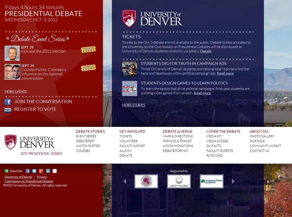
On March 31, 2011, the University of Denver (DU) applied to be one of three host sites for a Presidential Debate for the 2012 election. Seven months later, the Commission on Presidential Debates chose DU to hold the first debate on October 3, 2012. This left the university with less than a year to plan and prepare for all the high-security activities and learning opportunities that would soon unfold on the campus. For DU’s Division of Marketing and Communications, this meant building a website specifically for the debate—and building it fast. The DU web team had approximately 10 weeks to create and deliver.
To design the very best site for this historic event, DU turned to Modern Campus and their web content management solution, Omni CMS, as well as the latest trends in web development: responsive and adaptive design, or what they coined “redaptive” design. Redaptive design involves starting with the basic content and functionality of a site and then augmenting it for more advanced platforms (otherwise known as the mobile-first approach, progressive enhancement, or adaptive design). And, at the same time, optimizing the content for when it is stretched across a range of displays (responsive). All this is conveniently controlled through the modification or updating of one site.
Redaptive design starts with basic content and functionality of a site and then augments it for more advanced platforms while optimizing the content for a range of displays.
Do Your Homework
"If you’re going to do something new, make sure you know what you’re doing," said Jon Liu, DU’s Web Developer. He was sent to New York for the Future of Web Design conference a week after DU was chosen as a host site. At the conference, Jon learned just how radical the responsive/adaptive shift is in web development.
Jon’s experience in New York molded him into the cheerleader needed to push the rest of the DU web team to take this redaptive approach for DU’s debate site. Examining the main DU site’s data helped drive the idea, too. The web team discovered that mobile traffic had increased 1,200% since 2009 (when Google started tracking mobile). More importantly, visitor devices ranged tremendously with over 580 different screen sizes reported, which made targeting popular devices and sizes for website construction difficult.
With these analytics in mind, the next step for the team was to get buy-in from DU’s stakeholders. After live demos, the web team was given the go-ahead and a strict delivery time; the university wanted the DU debate site launch to coincide with President’s Day on February 20, 2012. The team got right to work, but what is usually a linear process turned into a great deal of back and forth between design and development.
More Work Up Front = Better User Experience
The DU web team had to relearn everything. Designing redaptively meant a new way of thinking and writing code. Bandwidth availability became a big issue, affecting file sizes, page loads, and so forth. And because not many others are using the design style in higher education today, there are no standards, no examples. The team had to use a learn-as-you-go method. Jon advocates starting out by building in a web browser:“You don’t need to develop all your Photoshop files for all your break points and then start developing.”Of course, they figured this out the hard way. They had to completely rewrite their break points after they dropped the code in and found even their web fonts weren’t working properly. Writing the code while in the browser gives you the ability to test with tools and reveal problems sooner.
Testing Time Required
DU finally caught a break while importing the code into Omni CMS, as they didn’t need to create all new templates. With redaptive design, they only had a single page of markup that would generate each device display. The debate site’s sleek look and functionality were coming together at last. When it came time to field test, the web team used the Mobitest tool to check the debate site for mobile device performance. They found that it had a fast loading time, which is important. Sixty percent of mobile users expect your site to load in 3 seconds or less, and 74% will leave if loading time exceeds 5 seconds. To further assess load time, the team pulled up the debate site on as many physical devices as they could get their hands on. They even visited local coffee shops to test mobile cell networks.
The Evolving User Experience
Though the site was a lot harder to implement than expected ("65.87% more work," claimed Jon Liu), the web team agreed that going redaptive was worth it. They were even able to meet the February 20 deadline; though, if given more time, they would have focused on server-side optimization. Nevertheless, the university was able to rest assured that its students and the community would find information and learn about activities leading up to the big debate, no matter what device they used.
Working on the debate project not only proved we’re able to create a site with ground-breaking technology, but that Modern Campus will work with us to ensure such a project’s success and support within the CMS.
With the experience gained through development of this project, the team now knows what to expect as they go through the process of converting DU’s main site into a redaptive design. As more capabilities are introduced to the market, such as the adaptive image element in HTML5, they will incorporate those capabilities into their site and develop it for the evolving user experience. They also plan to continue using Omni CMS. Modern Campus even used their feedback to enhance the Multi-Output Preview functionality to allow users to easily preview responsive designs inside the CMS in various form factors (phone and tablet) and orientations (portrait and landscape) without having to adjust or resize their browsers.
Tackle your biggest challenges